Chinese Jacquard Motif Meaning: Dragon, Peony, Jade Rabbit
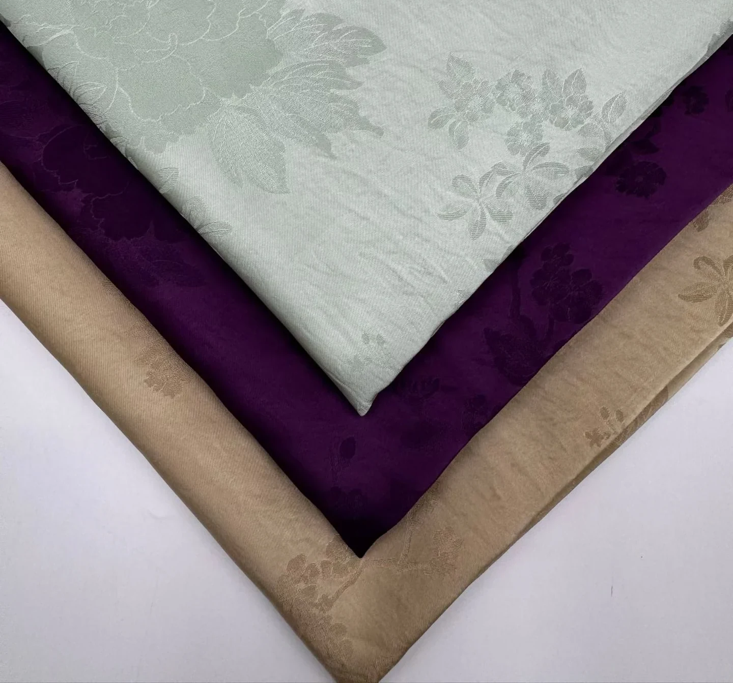
Short answer: most Chinese motifs fall into three groups — those with a specific referent (the jade rabbit is the moon), those with a traditional vocabulary but a wide meaning (the peony means prosperity and can sit on almost anything), and designs deliberately without a motif. Getting the group wrong is what loses a season: the jade rabbit is a Mid-Autumn symbol, and a Western buyer reading “rabbit” sees Easter, which is spring.
Written for buyers who have been shown twelve designs, liked three, and need to know which one they can actually sell — in their market, in their category, without a customer asking a question they cannot answer.
Why Motif Meaning Matters Commercially
Most articles on Chinese textile symbols are written as cultural history. This one is not. It is written from the position of someone who has to ship 3,000 metres to a customer and would like the customer to reorder.
Three specific things go wrong when a buyer picks a motif without knowing what it means.
One: the garment sells into a market that reads the symbol differently, or not at all. A design that is powerful in Shanghai can be neutral in Milan and faintly comic in a Midwestern department store. That is not a reason to avoid it. It is a reason to know which of those three you are selling to.
Two: the motif belongs to an occasion the garment is not for. Some symbols in Chinese textile tradition are tied to a season or a ceremony. Using one outside its occasion is not offensive, but it does waste the symbol — you paid for a message and delivered noise.
Three: the buyer cannot answer the question. A retail buyer, a merchandiser, or a customer will eventually ask "what is this pattern?" A supplier who can give one clear sentence is easier to work with than one who says "it is traditional". That sentence is worth more than the design fee.
There is also a fourth, which is the one this article spends most of its length on: motif density constrains what you can manufacture, and that constraint is harder than any cultural question. A design that breaks at every seam is unusable for a tailored garment no matter how beautiful the symbolism is.
Part 1: Three Kinds of Motif, and Why the Difference Matters
The twelve designs in a typical Chinese jacquard range are not twelve variations on one idea. They fall into three groups, and the group determines how much thinking you have to do.
1.1 Motifs With a Specific Referent
These are designs where the motif points at something particular: a creature, an object, a scene. The dragon. The jade rabbit holding a brocade ball. The coin and the teapot. The garden pavilion.
These carry the most meaning and the most risk. They are the designs a customer will ask about, and they are the designs that can be wrong for a market or an occasion. They are also, when they land, the designs that sell at a premium — because a garment with a story is easier to merchandise than a garment with a texture.
What you need to know: what the motif refers to, what occasion it belongs to if any, and whether your market has a competing association.
1.2 Motifs With a Traditional Vocabulary But a Wide Meaning
The peony. The butterfly. The bird-and-flower composition. The scrolling vine. These are traditional — they have been in Chinese textile design for a very long time — but their meaning is broad rather than specific. A peony says prosperity and abundance. A butterfly says transformation, or romance, or long life, depending on who you ask and what it is paired with.
These are the safest designs commercially, because almost no market reads them negatively. The trade-off is that they also do not carry a story strong enough to merchandise on. You sell them on how they look, not on what they mean.
What you need to know: whether the motif has a competing meaning in your market, and how large it runs — because these are usually the designs where scale determines cuttability.
1.3 Designs Deliberately Without a Motif
Four of the twelve designs in a full range are built with the figurative elements removed and only the floral structure kept, all in tone with the ground. No dragon, no rabbit, no pavilion — flowers and leaves only, in the same colour as the base cloth.
These exist for a specific reason, and it is worth stating plainly because it is often misunderstood as a cost-saving choice: they are for buyers who want the surface quality of a jacquard without a motif that has to be explained. At a distance they read as a textured satin. Up close the floral structure appears. Nothing in them requires a translator, a market study, or an explanation to a customer.
If your market is unfamiliar with Chinese motifs, or if your brand's identity would be diluted by a recognisable symbol, this is the group to buy from — not because the figurative designs are risky, but because you may not need what they cost.
What you need to know: almost nothing. The decision is colour and weight, not meaning. The main thing to check is that the tonal step between motif and ground is wide enough that the design does not disappear entirely on your chosen colourway.
1.4 The One-Line Summary
| Group | What it costs you in thinking | What it pays you back |
|---|---|---|
| Specific referent (dragon, jade rabbit, coin, pavilion) | High — you must know the meaning, the occasion, and your market's reading | High — a story to merchandise, and a reason for a premium |
| Traditional vocabulary (peony, butterfly, bird-and-flower, vine) | Low — no market reads these negatively | Medium — sells on appearance, not on story |
| No motif (tonal floral, 16–19 colourways) | Almost none — colour and weight only | Low — nothing to merchandise on, but nothing to explain either |
Part 2: Motif by Motif
For each motif: what it refers to in Chinese usage, what it tends to read as in Western markets, what to watch for in other markets, and where it works and does not work as a garment.
A caveat stated once and applying to all of it: this is not a study of Chinese iconography. It is a summary of what these motifs are generally understood to mean in Chinese textile usage, written for sourcing decisions. If you need the art-historical version — dynasty, provenance, regional variation — that is a different discipline and this article will not serve you.
2.1 The Dragon
In Chinese usage. The most loaded symbol in the vocabulary. It is associated with imperial power, with rain and water, with potency and good fortune. It is a beneficent figure, not a monster — this is the single most important thing to understand, because the Western default is the opposite.
How it is drawn here. Long, curled body; whiskers drawn out from the head; no legs visible in the repeat. It reads as movement through the cloth rather than as a creature standing still. That is a design decision with a practical consequence: a legless, flowing dragon survives being cut into panels far better than a fully rendered one, because there is no limb to sever at a seam.
Western reading. Two competing associations. The older one is the dragon of European folklore — the adversary, the thing that gets slain. The newer one, roughly a century old in fashion and interiors, is chinoiserie: the dragon as exotic ornament, desirable precisely for being foreign. In contemporary womenswear the second reading usually wins, particularly in occasion dressing and in anything sold as statement outerwear.
The practical consequence: a dragon reads as bold and Eastern in London and as auspicious in Shanghai. Both are positive. Neither is neutral. If your brand position is quiet minimalism, this is not your design.
Where it works: cheongsam and qipao silhouettes, ceremonial jackets, statement outerwear in a simple cut, and flat home textiles — cushions, runners, wall panels.
Where it does not: anything with a lot of seams or darts. This is the densest design in a typical range, with very little plain ground between motifs, so the pattern breaks at every seam. It is also a poor fit for childrenswear in most Western markets, not for reasons of meaning but because a dense dark-ground figurative print reads as adult.
What to say to a customer: "It is a Chinese dragon — a symbol of good fortune and power, not the European monster. This one is drawn without legs so it flows across the cloth."
2.2 The Jade Rabbit and the Brocade Ball
In Chinese usage. This is the most occasion-specific motif in the range. The rabbit is the jade rabbit of Chinese festival tradition — the companion of the moon goddess, tied to the Mid-Autumn Festival. It is drawn here holding a brocade ball, with long ears laid back and a rounded body, surrounded by fruit, flowers and an auspicious knot with visible loops.
The occasion is the point. This motif belongs to autumn and to a specific festival. In Chinese-speaking markets that is an asset: the motif carries a seasonal message that buyers read immediately, which is exactly what a seasonal collection needs.
The collision to watch for. In Western markets, a rabbit means Easter. Not Mid-Autumn — Easter. A buyer who puts this design into a spring collection because "rabbits sell in spring" will have shipped a Mid-Autumn motif into an Easter window. The two festivals are in different seasons and mean entirely different things, and the customer will not be able to tell you why the garment feels slightly off.
This is the clearest example in the whole range of a motif that is not wrong, but is timed wrong. If you sell to a market without a Mid-Autumn tradition, either sell it as a festival piece in the right window, or do not sell it as a rabbit at all — sell it as a floral with a small figure in it.
Where it works: festive and seasonal collections, gift textiles, cushion covers, childrenswear in East Asian markets.
Where it does not: anything that will be merchandised as spring/Easter in a Western market, and narrow panels or heavily seamed garments, where the figure gets cut and stops reading as a rabbit.
What to say to a customer: "It is the jade rabbit of the Mid-Autumn Festival — a moon-festival symbol, autumn. The ball it holds is a brocade ball, a token of good fortune."
2.3 The Coin and the Teapot
In Chinese usage. Both are auspicious objects, and both sit in the same dense composition as the dragon — a coin, a teapot, a lattice grid, and scrolling vines tying the composition together. The coin is wealth. The lattice is a window or screen form, domestic and architectural.
The teapot is the more interesting one commercially, because it is a daily-life object rather than a cosmic one. It reads as domestic, cultured, leisurely — tea as a practice rather than a drink.
Western reading. The coin can drift toward a gambling or currency association, which is not what you want on a garment. It is small enough in most compositions that this rarely becomes the dominant reading, but on a large-scale cut it can. The teapot reads as chinoiserie domestic and is unusually safe — it is charming rather than loaded, and it signals craft and leisure in a way that suits home textiles particularly well.
Where they work: as part of a dense composition, in home textiles — cushions, table linen, panels — and in statement garments where the cloth is seen flat.
Where they do not: where the object would be isolated by a cut. A coin cut in half is not a coin. Plan the lay so the objects sit whole, or use a design without them.
2.4 The Peony and the Butterfly
In Chinese usage. The peony is the flower of prosperity and honour — the "king of flowers" in Chinese usage. The butterfly carries several readings, of which transformation and romance are the two that matter for garments.
Paired, they are one of the most durable combinations in Chinese decorative art. In this range the peony is the main event: each bloom drawn large and open with petal layers visible, butterflies placed between the blooms rather than on top of them, foliage trailing from one bloom to the next so the composition reads as a continuous garden rather than scattered flowers.
Note the proportion, because it is a design statement: the butterflies are small relative to the peonies. This is a floral design with insects in it, not an insect design with flowers. If you are selling it as a butterfly print, you are selling something it is not.
Western reading. Peony is a garden flower with positive, uncomplicated associations — it is fashionable in its own right in Western floristry and bridal work. Butterfly is universal and positive. Neither carries a competing negative reading anywhere significant.
This is the safest figurative design in a typical range for Western markets, and it is also the one that photographs best, because the blooms are large enough to read on a screen.
The constraint is scale, not meaning. The peony runs big. Narrow panels will cut it. Plan the lay for a wide panel, or accept the cut as part of the design.
Where it works: dresses with volume, kimono-style wraps, scarves, and any garment where a large floral can sit uninterrupted.
Where it does not: close-fitting tailored pieces and anything with many small pattern pieces.
2.5 Bird and Flower
In Chinese usage. One of the oldest compositional structures in Chinese textile design: a flowering branch as the frame, birds placed on and around it, small insects filling the empty space. Here the birds appear in two positions — one perched on a branch, one in flight — with branches curving through the cloth rather than running straight.
The structure is a frame, not a repeat. That is what makes it legible at small scale, and therefore what makes it survive being cut into panels better than the peony-only designs. Among the figurative designs, this is the most forgiving one to manufacture.
Western reading. Reads as a botanical or toile de Jouy relative — birds among branches is a familiar Western decorative idiom too. Very little translation needed.
Where it works: dresses, blouses, light jackets — particularly anything with panels and seams, where the framed structure tolerates cutting.
One thing to keep straight: there is no architecture in this design. The next design in the same family does have buildings, and the two are sometimes confused because they share a base weave and a palette. If you are ordering one, be sure which.
2.6 The Garden Pavilion
In Chinese usage. A pavilion with an upturned eave at the centre of the repeat, framed by rockery and trees, butterflies scattered through the open space above and around it. The whole thing is composed as a garden view — a framed scene rather than an allover pattern.
Rockery in a Chinese garden is not landscaping in the Western sense; it is a sculptural object collected and arranged for contemplation. A garden scene with pavilion and rockery is a recognisable idiom, not an arbitrary picture.
Western reading. This is the design that most directly evokes chinoiserie — the eighteenth-century European taste for Chinese garden imagery in wallpaper, porcelain and textiles. That is an advantage in interiors and a limitation in fashion: chinoiserie reads as decorative and historical, not as modern.
It is also the only design in the range with architecture in it, which makes it the most distinctive and the most demanding. The pavilion needs space to read. On a narrow panel or across a seam it stops being a building and becomes a shape.
Where it works: statement dresses, ceremonial garments, wall panels, large cushions — anywhere the fabric is the subject and can sit flat and whole.
Where it does not: anything narrow, anything with a centre seam, anything where the garment's construction will slice the scene.
What to say to a customer: "It is a Chinese garden scene — pavilion, rockery, butterflies. The composition is a framed view, the way a garden is seen through a window."
2.7 The Scrolling Vine
In Chinese usage. Continuous vine work with florals worked into the curves rather than sitting on top of them. The vines curve across the cloth without a clear repeat boundary. The idiom of the endless scroll — continuity, length, unbroken line — is old and widespread, and it appears in many textile traditions, not only Chinese ones.
Western reading. Reads as an allover damask or a vine trellis. Essentially no translation needed, and no competing meaning in any major market.
Why it is the most useful design in the range for manufacturing: there is no motif that has to be matched at the seam. It is the most forgiving design for cutting, which makes it the right answer for tailored garments, panelled construction, and anything where a figurative motif would be severed.
It is also the design most often available in a very wide colour range — nineteen colourways off one weave in a typical range, running from pale neutrals through golds and olives to deep reds, so a buyer can build a full seasonal palette from a single quality.
Where it works: essentially anything. This is the design to specify when you need a jacquard surface and cannot afford motif constraints.
Part 3: How Three Markets Read the Same Cloth
The same twelve designs do not perform equally in different markets, and the reason is rarely the motif's meaning in China. It is what the motif collides with locally.
What follows describes patterns observed in sourcing conversations and in how buyers describe their own markets. It is not market research. Treat it as a set of hypotheses to check against your own customers, not as a rulebook.
3.1 Europe
Europe has its own long history with Chinese imagery, and it shapes the reading more than anything in the source culture does. Chinoiserie — the eighteenth-century European taste for Chinese motifs in wallpaper, porcelain, lacquer and textiles — means a European buyer is not encountering these designs fresh. They are encountering them as a recognised decorative category.
What that does:
- Pavilion and garden scenes read as heritage decorative, which is an asset in interiors and a limitation in contemporary fashion. They signal tradition, not now.
- Peony and butterfly read as florals, essentially without an ethnic frame at all. In much of Europe this is the path of least resistance — the design sells on being a good floral, not on being Chinese.
- The dragon reads as statement. In occasion dressing and in anything positioned as bold, it works; in a quiet minimal collection it fights the brand.
- Restraint sells. A tonal design that reads as textured satin at a metre and as a floral at arm's length tends to outperform a figurative design at the same price point in Northern European markets.
The specific trap: European buyers sometimes assume the figurative designs are "more authentic" and the tonal ones are cost-reduced. The reverse is closer to the truth in terms of design intent: the tonal designs are the harder ones to compose, because with the motif removed there is nothing to hide behind. All the interest has to come from the weave.
3.2 The Middle East
Two things matter here, and the second is more important than the first.
First, the decorative tradition. Islamic decorative art has a deep and sophisticated tradition of geometric and vegetal ornament, and comparatively less emphasis on figurative representation in religious and architectural contexts. This means florals, vines and lattice work are not foreign vocabulary — they are adjacent to a tradition the market already values. A scrolling vine or a tonal floral can read as familiar rather than exotic.
Second, and this is the part to get right: do not treat figurative motifs as prohibited. Contemporary fashion and home textile markets across the region carry animal and figurative patterns widely. The aniconic tradition is a real and important feature of Islamic art, but it does not translate into a blanket commercial rule about garments. Assuming it does is how buyers lose orders they could have won.
What to actually do: ask the customer. Not "do you accept figurative motifs" — that question puts them in an awkward position. Ask instead which designs in a range they have sold before, and let them choose. A buyer who has sold florals for a decade will tell you immediately; a buyer who has sold figurative work will too.
Where this range usually lands: the vine, the tonal floral, and the peony tend to be the easiest starting points. The dragon and the pavilion are not excluded — they are simply specific, and specificity needs a reason. If the collection has a story that supports them, they work.
A note on colour: in this range the deep and saturated colourways — the wine reds, the turmeric yellows, the deep purples — tend to be the ones that hold up in markets where the cloth is worn for occasion dressing and seen under warm artificial light. The pale tonal colourways read as texture and can look flat in that setting.
3.3 North America
The North American market reads these designs through two filters that have nothing to do with China.
Filter one: seasonality is commercial, not cultural. A motif that carries an occasion in its source culture becomes a product calendar decision here. The rabbit case in Part 2.2 is the sharpest example: a Mid-Autumn motif placed into a spring/Easter window because "rabbits sell in spring". The garment will not fail loudly. It will just feel slightly wrong to the customer, and nobody will be able to say why.
Filter two: large-scale florals are a category, not a motif. North American womenswear has a well-established appetite for big floral prints. A large peony reads as a floral dress first and as a Chinese design second, or not at all. That is usually good news commercially — it widens the market — but it means you should not pay a premium for the cultural story if the customer is never going to hear it.
What works: peony, bird-and-flower, and tonal floral at the accessible end; dragon and pavilion for statement and occasion, where a story is an asset rather than an obstacle.
3.4 Southeast Asia and Overseas Chinese Markets
This is the one market where the figurative designs need no translation at all. In Malaysia, Singapore, Indonesia, Thailand and the Chinese diaspora more broadly, the dragon, the jade rabbit, the peony and the pavilion are read immediately and correctly, including the occasion associations.
The commercial consequence is that these designs can be sold as themselves rather than as exotic decoration. Festival timing, gifting occasions and ceremonial dressing all become viable, and the motif carries the merchandising rather than the styling.
It also means the standard is higher. A buyer in this market will notice if the dragon is drawn wrong, if the rabbit's proportions are off, or if the pavilion's architecture is not plausible. These are not abstract concerns — they are the difference between a design that reads as respectful and one that reads as a foreigner's approximation. This is worth raising with your supplier explicitly: ask whether the motifs were drawn by someone who knows the vocabulary.
Part 4: Density Is a Harder Constraint Than Culture
This is the part of the article that will save you the most money, and it has nothing to do with meaning.
Every design has a density — how much of the surface is motif versus plain ground — and density determines what you can manufacture. A dense design breaks at seams. A framed scene needs width. A large bloom needs a wide panel. None of these constraints care how good the symbolism is.
4.1 The Density Table
| Design type | Density | Cutting tolerance | What it is for |
|---|---|---|---|
| Dragon with objects | Highest — very little plain ground between motifs | Low — the pattern breaks at every seam | Cheongsam, ceremonial jackets, flat home textiles. Not tailored garments with darts. |
| Pavilion scene | Medium, but spatially framed | Low — the scene must sit whole | Statement dresses, wall panels, large cushions. Not narrow panels or centre seams. |
| Peony and butterfly | Medium — large blooms with trailing foliage | Medium — blooms get cut on narrow panels | Dresses with volume, wraps, scarves. Plan a wide lay. |
| Bird and flower | Medium — framed composition with open space | High — legible at small scale, tolerates cutting | Dresses, blouses, light jackets with panels and seams. |
| Scrolling vine | High density, but no discrete motif | Highest — nothing to match at the seam | Anything. The design to specify for tailored construction. |
| Tonal floral | Low contrast, continuous | Highest — no motif boundary to align | Anything. Reads as textured satin at distance. |
4.2 The Two Rules That Follow
Rule one: if the garment has many pattern pieces, do not buy a framed or figurative design. Every seam is a cut, and every cut through a motif costs you the motif. A pavilion sliced by a princess seam is not a pavilion. This is not a quality problem — the cloth is fine — it is a design mismatch, and it will not show up until the samples come back.
Rule two: if the design has a repeat with a defined motif, plan the lay before you commit the order. The peony is large. On a narrow panel it gets cut. Either plan for wide panels or accept the cut as part of the design — but decide before you cut 3,000 metres, not after.
4.3 Why the Dense Designs Still Exist
If dense designs are harder to use, why does a range include them?
Because the constraint and the value are the same property. A design with very little plain ground announces itself. It is the design that makes a simple garment into a statement piece, and it is the design that a customer photographs. In home textiles — cushions, panels, runners — where the cloth is seen flat and whole, density is pure advantage and the cutting constraint does not apply at all.
The mistake is not buying a dense design. The mistake is buying a dense design for a garment with twelve pattern pieces.
Part 5: How to Explain It to a Retail Buyer
Sooner or later someone asks what the pattern means. Three sentences, one per motif group, will cover almost every conversation. Learn these and you will never be caught saying "it is traditional".
5.1 For the Dragon and Objects Design
"The dragon is a Chinese symbol of good fortune and power — in Chinese usage it is a beneficent figure, not the European monster. Around it are auspicious objects: a coin for wealth, a teapot for cultured domestic life, and a lattice screen. The dragon is drawn without legs so it flows across the cloth rather than standing still in it."
That last clause is worth keeping. It converts a design detail into a reason the garment works, which is what a buyer actually needs.
5.2 For the Peony and Butterfly
"Peony is the flower of prosperity in Chinese usage — the king of flowers. The butterflies are secondary: this is a floral design with insects in it, not an insect design with flowers. The blooms run large, so the garment needs a wide panel to let them sit whole."
The proportion point matters. Buyers who describe this as a butterfly print will merchandise it wrongly, because the customer will be looking for butterflies and will find flowers.
5.3 For the Pavilion
"It is a Chinese garden scene — pavilion, rockery, butterflies — composed as a framed view, the way a garden is seen through a window. It is the only design in the range with architecture in it, which is why it needs a flat, wide surface to read."
5.4 For the Tonal Designs
"There is no symbol in this one. Flowers and leaves only, all in the same tone as the ground — the interest is the weave, not a motif. It reads as a textured satin at a distance and as a floral up close."
This is often the most useful sentence in the whole set, because it lets a buyer put a jacquard into a collection that would never carry a dragon. "No symbol" is a feature, not an absence.
5.5 The One Thing Not to Say
Do not say "it is traditional Chinese" and stop there. It is true, it is unhelpful, and it signals that you do not know. A buyer who hears it will either not use the design or will invent an explanation of their own — and an invented explanation about someone else's culture is how brands get into trouble.
Part 6: When to Choose a Design With No Motif
Four of twelve designs in a full range are built with the figurative elements removed. They are often treated as the safe, boring, lower-value option. That reading is wrong in both directions — they are not boring, and they are not lower-value. They are the right answer in a specific set of situations.
6.1 Five Situations
One: your market does not read Chinese motifs. If you sell into a market where a dragon is a novelty and a pavilion is a curiosity, you are paying for a story nobody hears. Buy the surface quality instead. You get the same jacquard hand, the same light behaviour, the same durability at folds — without the cultural load.
Two: your brand is built on restraint. A minimal or architectural brand cannot carry a dragon. It can carry a tonal floral, because at a metre that design reads as a textured satin with surface movement. The cloth adds quality without adding a message that fights the brand position.
Three: the garment has a strong silhouette. When the shape is the point, a figurative motif competes with it. A tonal design does not. This is the single most common reason a designer chooses tonal over figurative, and it is a design reason, not a commercial compromise.
Four: you need many colourways from one quality. A tonal design typically runs to sixteen or nineteen colourways off a single weave, because there is no motif to re-programme per colour. That lets a buyer build a full seasonal palette — warm, cool, formal, casual — from one fabric, one price, one lead time. A figurative design rarely offers that range, because each colourway has to keep the motif legible.
Five: you need cutting tolerance. No motif means no motif boundary, which means nothing to align at the seam. For panelled construction, this matters more than anything in the design.
6.2 What You Give Up
Be clear-eyed about the trade. A tonal design gives you no story to merchandise. In a retail environment where the product description has to earn attention, "textured floral jacquard in a tonal ground" is a weaker line than "dragon and auspicious objects". If your channel sells on narrative — boutique, direct-to-consumer with editorial content, gift market — the figurative designs earn their premium and the tonal ones may underperform.
The decision is not "which is better". It is "does my channel sell the cloth or the story".
6.3 A Practical Middle Path
If you are unsure, buy one figurative design and one tonal design in the same base cloth, and put both into the same collection. The base is identical — same composition, same weight, same width, same hand — so the two read as a family rather than as two purchases. The figurative piece carries the story; the tonal pieces carry the volume.
This is also the cheapest way to find out which one your market actually buys, because you learn it from sell-through rather than from a buyer's opinion.
FAQ
Is the Chinese dragon a bad symbol?
No — the opposite. In Chinese usage the dragon is associated with power, good fortune, rain and water, and imperial authority. It is a beneficent figure. The Western association with a monster to be slain is a separate tradition and does not transfer. This is the single most common misunderstanding about these designs, and it is worth correcting proactively rather than waiting to be asked.
Which dynasty are these motifs from?
That is not a question this article can answer, and any supplier who answers it confidently without a source is guessing. What can be said is that the vocabulary — dragon, peony, butterfly, bird-and-flower, scrolling vine, garden scene — is long-established in Chinese decorative art and appears across many periods and media, not only textiles. If provenance matters to your project, that is a specialist question and should be answered by someone working from primary sources, not from a fabric catalogue.
Can the jade rabbit design be sold outside Mid-Autumn?
It can be sold, but the occasion is the design's main asset and selling it outside the occasion wastes it. In markets with a Mid-Autumn tradition, the motif carries a seasonal message that does the merchandising for you — that is worth timing correctly. In markets without one, the rabbit will be read as a rabbit, and in Western markets that usually means Easter, which is the wrong season and the wrong festival. Either place it in the right window or choose a design without a figurative element.
Will Middle Eastern customers accept a dragon?
Do not assume they will not. Contemporary fashion and home textile markets across the region carry figurative patterns widely. The aniconic tradition in Islamic art is real and significant, particularly in religious and architectural contexts, but it does not function as a blanket commercial prohibition on garments. The practical answer is to ask the customer which designs in a range they have sold before, and let them select. Assuming a restriction that does not exist costs orders.
What is the difference between the peony design and a rose design?
Botanically and visually: a peony is drawn with many layered petals in a large open bloom; a rose is drawn with a tighter spiral centre and fewer, more cupped petals. In this range the two sit in different design families and read differently — the peony is the main event of its composition, with butterflies placed between blooms; the rose design is stripped back to roses and foliage with no figurative elements at all, and reads as a soft surface shimmer at a distance. Commercially, the peony is the stronger statement and the rose is the quieter one.
Will the pattern wear off?
The pattern is the weave, so there is no layer to wear off. What can still change is the colour, through light exposure, washing and abrasion — that is a dyeing property, not a weaving one, and it applies to any dyed textile. Ask for wash and rub fastness data on the actual dye lot. ISO 105-C06 and ISO 105-X12 are the usual references; AATCC 61 and AATCC 8 are the US equivalents.
Can we change the motif to our own design?
Recolouring an existing design is straightforward — the weave is set and the colour is matched to your swatch by dyeing. Changing the motif itself means a new jacquard programme, which is a matter of programming time priced per design rather than a ceiling on what can be woven. A range on a supplier's page is usually a selection, not a full capability list: ask what they can programme instead of judging by how many designs are displayed.
Which designs work for tailored garments?
The scrolling vine and the tonal floral, without question — neither has a discrete motif to sever at a seam. Among the figurative designs, bird-and-flower has the best tolerance because its composition is a frame with open space, and it stays legible at small scale. The dragon and the pavilion are the worst choices for tailoring: one is too dense, the other needs a flat unbroken surface.
Are the designs without a motif cheaper?
Not necessarily, and it is a mistake to assume so. The cloth is the same construction, the same weight, the same finishing route. What changes is the jacquard programme, and a tonal design is not automatically simpler to weave — with the motif removed there is nothing to conceal a poorly resolved weave, so the structure has to be right on its own. Ask for the price on the specific design rather than assuming a hierarchy.
How do I know the motifs are drawn correctly?
Ask directly whether the designs were drawn by someone who knows the vocabulary. A dragon without legs is a deliberate design choice that works; a dragon with the wrong proportions, a rabbit whose ears are set wrong, or a pavilion whose architecture is implausible will be noticed immediately by buyers in Chinese-speaking markets. This is a reasonable question to put to any supplier offering Chinese motifs, and the answer tells you something about how the range was built.
Next Steps
If you know your market: go to Part 4 and check the density table against your garment construction. That is the decision that will actually cost you money if you get it wrong.
If you do not know your market: order one figurative design and one tonal design in the same base cloth, put both into one collection, and let sell-through decide. Cheaper than a market study and more reliable than an opinion.
If you want to see the twelve designs: they run in four families, from tonal butterfly florals at the restrained end to a dragon with auspicious objects at the dense end — all on one base cloth: 97% polyester / 3% spandex, crepe jacquard with an acetate-like hand, 150 gsm, 150 cm usable width, 300 metres per colour, 7–10 days after colour confirmation.
Sample the quality before you choose the colour. The weave, not the shade, decides whether a design suits your garment. Colour can be matched to your swatch afterwards.
Two related guides: the Chinese jacquard buying guide covers construction, colourways, cutting waste and care in full. The jacquard versus print guide covers how to verify that what arrives is actually woven.
Ask for a swatch pack. We would rather you check.
Sources and Scope
What this article is. A sourcing-oriented summary of how the motifs in this range are generally understood in Chinese textile usage, and how they tend to be read in three export markets. It is written to support buying decisions.
What it is not. It is not a study of Chinese iconography, art history, or folklore. It does not give dynasty, provenance, or regional variation, because those require primary sources this article does not draw on. Where the meaning of a motif is broad or contested, the article says so rather than picking one reading.
On the market observations. Part 3 describes patterns observed in sourcing conversations and in how buyers describe their own markets. It is not survey data and should be treated as a set of hypotheses to test against your own customers. Any buyer who treats it as a rulebook is using it wrongly.
On the product specifications. Composition, weight, width, minimum order, lead time and colourway counts describe this range and are stated on each product page. They are not presented as industry norms.
Test methods referenced, cited by standard number only: ISO 105-C06 (colour fastness to laundering), ISO 105-X12 (colour fastness to rubbing), AATCC 61 and AATCC 8 (the US equivalents), OEKO-TEX Standard 100 (harmful substance testing).
Mujia Textile — running our own air-jet looms in Zhuji since 2012.